Product
Smart check: why checked items belong at the bottom

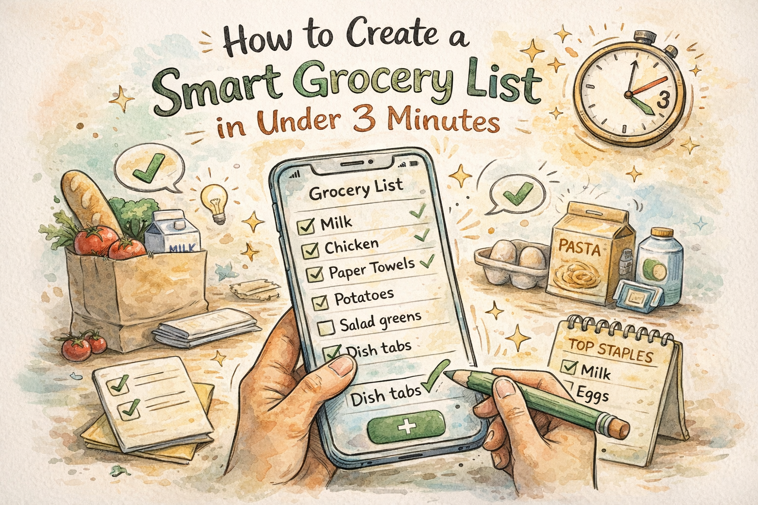
The first version of a grocery app usually gets checkboxes right in the technical sense: you tap, something marks done, and you move on. The failure mode shows up later, after you have used the same list through a busy week or a shared household, when the collection of finished items is long enough to fight the collection of things you still need. You scroll past strikethroughs, you lose place, and you add milk again because the earlier milk line exists but lives in visual noise. That is not a discipline problem. It is a layout problem dressed up as forgetfulness.
ListiMate uses smart check behavior so that when you mark an item complete, it moves toward the bottom of the list and leaves the active section short. The active section is what you scan in the cereal aisle while someone asks whether you already bought oats. Keeping that slice of the list small is the difference between a glance and a hunt. It also sounds like a minor interaction detail, which it is, until you count how many duplicate purchases and wrong-SKU grabs come from scanning fatigue rather than from bad intentions.
This article stays on that interaction: why separating "done" from "still need" matters cognitively, how it interacts with categories and duplicate prevention, and how to build shopping habits that match the tool instead of fighting it. If you want motion and context in product form, the home page demos under Smart Check show the same flow without the long explanation.
The psychology of done versus still-to-buy
Checked items are not visually neutral. Even a faint strikethrough pulls eye movement. If finished lines stay mixed with open lines, your brain pays a small tax on every pass: is this past or present? Under fluorescent lights, with a cart that needs steering and a kid who needs answers, that tax stops being small. You start rereading the same territory, you miss an open line, or you add a duplicate because the earlier line was checked and scrolled away.
Moving completed items to the bottom is not about hiding history. It is about ordering attention. What you still need to buy stays in the compact region you actually use while moving through the store. What you already grabbed stays available if you need to undo a mistake or verify what went into the cart, but it stops competing for the same visual band as the forward path. That separation matters most in execution mode, when you are standing, walking, and deciding in seconds. Planning mode at the kitchen table can tolerate a longer scroll; execution mode in aisle five cannot, and if one view serves both, you should bias the layout toward the harder environment.
Planning and execution also differ in how aggressively you should check items. Some people leave everything unchecked until checkout because that is how paper felt decades ago. Digital lists benefit from checking as you go because the interface can keep the active set short in real time, which paper only approximates by rewriting or squeezing notes into margins. If undo is easy and completed items stay reachable below the fold, early checking stops feeling risky. If undo is buried or completed items vanish, people delay taps, the active list stays long, and you lose the benefit of smart ordering altogether. Kids tapping wrong lines is a fact of life; a design that assumes perfect taps is a design that punishes real families.
How smart check works with categories, duplicates, and shared lists
Categories already split a long trip into mental chunks. Smart check within each category keeps each chunk legible: produce stays a readable band, pantry stays its own band, and you are not scrolling through a single soup of every checked item from every section. If you run one uncategorized list, smart check still helps, but you will hit the limits sooner because the scroll distance grows faster than the category case. That is one reason the organization piece on this blog matters alongside interaction design. The stores and categories article walks through layouts when you use multiple stores or sections; the short version is that structure and motion work together.
Duplicate prevention and smart check are related but not the same feature. Duplicate prevention stops two people or two hurried moments from creating "milk" twice. Smart check keeps the remaining lines easy to read so you are less likely to add milk out of frustration because you could not see the first line. When both are in play, you get fewer duplicate lines and fewer emotional duplicate adds. If you want the full system story, the no-duplicate article on this blog goes deeper; here the point is that tooling beats willpower when the list is long and the store is loud.
Shared lists add timing. Two shoppers can check and add in overlapping bursts, especially if one person starts at produce and another starts at dry goods. Real-time sync reduces surprises, but you still want a clear visual split between done and not done so nobody argues about whether the oats line was satisfied or accidentally toggled. If your household often splits the building, agree on who owns which sections so you are not fighting the same checkbox from opposite ends of the floor. The shared grocery list app page is a compact link to send someone who wants the product pitch without reading this full piece.
Reliability, offline behavior, and rhythm
A check should feel instant because the gesture is local. The network can catch up later for sharing and backup. If checking eggs ever blocks on a spinner, the problem is architectural: your attention is in the store, not in a loading state. Smart check assumes those taps are cheap and immediate, which pairs naturally with offline-first shopping in basements and back aisles where towers are weak. For more on family use when signal drops, offline grocery app for families and the offline benefits post in this blog cover the same reality with different emphasis.
Rhythm matters as much as layout. People who batch every check until the register lose most of the benefit of a moving active section because the list stays long for the whole walk. Checking as items land in the cart keeps the "still need" region short mid-trip and cuts duplicate adds when someone sends a last-minute text from the dairy cooler. The habit is learnable: one pass through produce, check what you took, glance at what remains active before you roll to the next section. It feels fussy until you compare error rates across a month.
Attention, accessibility, paper habits, and cadence
Shopping with a podcast, a child, or both means partial attention is the default, not the exception. A shorter active list is not a luxury in that mode. It is error prevention. Smart check is one way interfaces admit that users are not staring at pixels with full focus. Large tap targets and clear separation between states also help people with motor variance or low vision, and bright store lighting makes theme choice real rather than cosmetic. If white backgrounds fatigue you, the shopping list app with dark mode page explains the product side in one place.
Paper lists often fake this separation with columns, arrows, or a second list scribbled on the receipt. Digital lists need software to do that work without asking you to rewrite by hand. Moving checked items is one way to approximate "rewrite the short list" without stopping in the pasta aisle with a pen. Weekly shopping means a list that expands and contracts across days; smart check keeps the current run legible. Monthly bulk trips add many lines at once, so if you bulk buy, consider a separate section or list so the active region never feels like a spreadsheet. The weekly grocery list planner and monthly grocery list pages are useful bookmarks for those cadences.
Edge cases in the real store
Familiar stores reward list order that matches your walk; smart check keeps the tail of each segment short so what is left in the active area tracks what is left in your mental map. When a store resets an aisle, expect one messy week, then update your category order instead of fighting old muscle memory for a month. Weighed bulk items deserve a rule: check after the scale commits the weight, not when you first grab the bag, because that is where mistakes actually happen. Coupon and loyalty apps split your attention; keep the list authoritative for intent and treat discounts as opportunistic, not a parallel source of truth, or you will duplicate lines fast.
Self-checkout lines tempt you to tidy the list while you wait. That is fine if you are not blocking traffic. In a crowded aisle, finish the physical move first, then clean digital state when you step aside. Cold weather means gloves and clumsier taps; fewer scrolls and a shorter active list reduce how often you fight the glass. Travel breaks your aisle mental model, so lean on categories, check aggressively, and let the remaining active section tell you what you still need in an unfamiliar layout. The camping grocery list page is one scenario where unfamiliar stores show up often.
Recipe imports can dump too many active lines at once. Merge or collapse before you shop; smart check cannot fix a planning mistake, only execution. The meal planning article on this blog covers recipes and lists together if you want the longer arc. Some people treat unchecked items like moral failure; a list is a tool, not a report card. If plans change, clean the list at home, not in a guilt spiral in the parking lot.
Diet templates, students, and design tradeoffs
Template pages like vegan grocery list or paleo grocery list give vocabulary; the app still supplies the in-store rhythm. Fast trips with small baskets still benefit once a second person joins the list or the trip grows past a dozen lines. On the design side, some apps keep checked items inline but faded until the list is eighty lines long and the pattern breaks. Others hide checked items entirely and make undo scary. Smart check aims between: completed work stays reachable without pretending it is the same job as open work.
What to ignore and where to start
Ignore absolutes that say you must never read completed items. Sometimes you verify a picky recipe against what you actually grabbed. Scroll down, confirm, scroll back. The goal is ordered attention, not erased history. If you have not run a real trip this way yet, open thelistimate.com, use the mobile app for one shop, and let the active list stay short while you move. Boring improvements are the ones that stick, and smart check is one of the quiet ones that shows up in fewer wrong-cart moments over time.
Author
Ahmed Mahfouz
Founder of ListiMate, focused on building smarter shopping habits.